colls (she/her) (![[personal profile]](https://www.dreamwidth.org/img/silk/identity/user.png) colls) wrote in
colls) wrote in ![[community profile]](https://www.dreamwidth.org/img/silk/identity/community.png) iconbattles2019-05-25 06:18 pm
iconbattles2019-05-25 06:18 pm
Feedback Results

Feedback results below the cut.
I've included all the positive feedback and a count for any constructive feedback received. If you'd like you'd like your constructive feedback, please leave a comment to this post and note whether you want it in a screened or an unscreened comment.
Thank you to everyone who participated and everyone who left feedback!!
negative space #1
close crop #14


#1
- The colors are so bright and beautiful, and i love the textures used/yellow line around the outside. Amazing composition
- I love the vibrant complementary coloring! The clean colors, the broad shadow in this unusual color that brings together the brown of his sweater with the pink of the background. The soft lighting and soft look of his sweater - it all matches very well.
- I love the bold coloring and the outline used on the figure.
Constructive count: 2
#14
- Lovely colouring and the texture is great, making the crop really stand out.
- I like this icon! The way the white thing on the right is taken up again by the font color, and the way the text itself makes the viewer think about eyes and sharpness. I like the reddish coloring, it contrasts nicely with his eyes and earring.
Constructive count: 2
negative space #2
close crop #13


#2
- I really like the side crop with the text balancing it.The use of two soft colours is also a great choice.
- I like the tone-in-tone coloring of this icon. The text is beautifully understated, too.
Constructive count: 1
#13
- The contrast and coloring in this icon are perfect. Everything's crisp and beautiful. Her slightly wrinkled skin and throat are what makes this icon interesting, and they come out wonderfully. I also love how her earring fades into the shadows.
Constructive count: 2
negative space #3
close crop #12


#3
- That composition is amazing - i like that the image is focused on the left hand side, and the textures and blending of the hair into the image is great.
- I love the contrast here! The bright red figure pops really well against the complex monochrome background. I love how you combined the background image/texture with her back, though. It looks perfectly seamless and draws the eye. I also like the brighter stripe on the right as a counterweight for the subject, balancing out the icon.
Constructive count: 2
#12
- Perfect crop on this one, and well sharpened, i also like the shadows over his face.
- loving the focus on the eye and the contrasting effect.
- I love how his eye immediately draws the focus in this icon. That's really cool. I like how red his mouth, is, too.
- This is a very striking crop and I love the chiaroscuro effect! The focus is immediately drawn to his eye.
Constructive count: 2
negative space #4
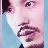
close crop #11


#4
- Lovely cropping, and good cut out, making it really stand out.
- The coloring is perfect. The subject looks nicely contrasted against the background and the colors look natural and work well together. The chosen cap is dynamic and it's just nice to look at with his interesting facial expression.
Constructive count: 2
#11
- Such a great capture of emotion! I like the colouring as well, the yellow background suits the faces very well.
- I love how happy and joyful this icon looks! I love the background texture you chose here, too. It brings out his blond hair and makes their skin colors look very natural.
Constructive count: 3
negative space #5
close crop #10

#5
- The cutout and cropping is lovely, with the blue and green background it really makes the subject pop. I also like how the lighting kinda looks like the sun.
- the colours in this are just amazing!
- The centering really works here and I like the soft lighting effect
Constructive count: 2
#10
- Amazing colouring, i like the contrast and the borders, making the framing of his face look really good.
- I like the blue and pink color scheme and the way you used pillars of the colors to frame the face and provide balance into the color distribution!
Constructive count: 1
negative space #6
close crop #9


#6
- I really like the cropping and the negative space, great soft colouring as well, it looks really dreaming
- the water colour effect in this is very pretty and I like how it adheres to the theme so well,really feels like he's in a peaceful space.
- I love the huge amount of negative space in this icon, and the paint texture you chose. It's nice that the only dark part of the texture is next to him, like a shadow. His slight blurriness makes him look like he's part of the watercolor painting, which is cool, too. I like how he's placed in the corner, too, his line of sight along the color divide in the background. It all plays together really nicely.
Constructive count: 2
#9
- I like how the focus is on the hands, very cool and well done cropping.
Constructive count: 3
negative space #7
close crop #8


#7
- The colouring and negative space, along with the textures is really good, just perfect.
- I like this icon! It's nicely sharp, which is hard to do with frizzy hair like that, and it's interesting to look at. I love the composition a lot! The fact that she is perfectly centered, but there is a bright stripe above her that throws off that perfectly centered balance: that makes this icon interesting to look at.
Constructive count: 2
#8
- Great cropping, i like how you can see the expression in her face still, and the contrasting green of her headscarf.
- this is a very nicely cropped icon,especially because of the subject looking up.
- Perfect! I love the crop, it's dynamic and interesting. I love the depth, light in the foreground and dark in the background, without washing out any details in either. I love the coloring - her skin color is beautiful and contrasts well with the red of her lips and the green of her hat.
Constructive count: 2
no subject
I'm requesting my own constructive feedback unscreened.
no subject
#7
- The icon is yellow all over, so it's hard for eve's face to stand out - i think if there was more contrasting/normal colored skin t would look great.
- I like this icon! It's nicely sharp, which is hard to do with frizzy hair like that, and it's interesting to look at. I'm not quite sure about the unreadable text on the bottom. It makes some parts of her jacket stand out, but not in a way that makes sense? I think having the icon dark at the bottom works well as a counterweight to the light stripe at the top, but I think it might work better if it was not text but just a dark stripe, maybe? I also think that her face is a little too yellow. Really just a little bit. Making the subject more vibrant than the background makes sense, but her jacket is not vibrant, so her face sticks out unnaturally. Maybe slightly desaturate her face, or add a color layer with a muted beige at low opacity to filter out the yellow? That's all I have in terms of concrit. I love the composition a lot! The fact that she is perfectly centered, but there is a bright stripe above her that throws off that perfectly centered balance: that makes this icon interesting to look at.
#8
- The skin is a little yellowish for me, and maybe a touch more sharpening.
- Perfect! I love the crop, it's dynamic and interesting. I love the depth, light in the foreground and dark in the background, without washing out any details in either. I love the coloring - her skin color is beautiful and contrasts well with the red of her lips and the green of her hat. I have no suggestions on how to improve any of it, it's awesome.
no subject
no subject
#1
- I'm not sure if it's part of the texture, or original icon, but the line on the bottom left hand corner is distracting. It could be a little sharper too. Just picking on details though!
- I love the vibrant complementary coloring! I'm not quite sure what the thing in the lower left corner is - it distracts a bit from the otherwise very clean composition. Otherwise, I think it's perfect - the clean colors, the broad shadow in this unusual color that brings together the brown of his sweater with the pink of the background. The soft lighting and soft look of his sweater - it all matches very well.
#14
- a little blurry for me, maybe a bit more sharpening.
- I like this icon! The way the white thing on the right is taken up again by the font color, and the way the text itself makes the viewer think about eyes and sharpness. His face looks slightly out-of-focus, which brings a nice intellectual contrast to this icon. Even though I might have wished it was a little sharper? But that is part of its appeal, I think. I like the reddish coloring, it's not too extreme as to feel unnatural, and it contrasts nicely with his eyes and earring.
no subject
no subject
#4
- I think the background is a little dark, making it seem dull overall. a lighter background would make it really pop.
- The subject feels a bit detached from the background. I think this is due to the subject being lit from the top right while the icon bacground has something that looks like a light source on the top left, so the shadows don't match. This could be solved by flipping either the subject or the background, with tweaking of shadow colors if necessary. Additionally, the crop could stand to show off more negative space.
- Does the red-white thing in the upper-left corner have a significance? It draws the eye because it is so bright, but if it doesn't mean anything, I think it might look better if the background were less bright than the subject. If it is significant, it works okay, because it balances the slightly off-center subject. I just can't tell without canon knowledge. As to sharpening: the lines on the inside of the subject are well smoothed, but the edges of his hair are a little sharp in comparison. Maybe feather the mask there just slightly to get a more coherent look. Coloring: the coloring is perfect. The subject looks nicely contrasted against the background and the colors look natural and work well together. The chosen cap is dynamic and it's just nice to look at with his interesting facial expression.
#11
- For me, it's a little blurry - maybe a bit more sharpening.
- It's a cute screencap and I feel if the cropping had been done somewhere in the center so that the icon would get half of both of their faces,then it would be more of a close crop and really showcase their expressions.
- I love how happy and joyful this icon looks! I have the exact same point of critique as in your other icon: the subjects look slightly blurry on the inside, but the mask around their hair is jagged. In this case, because there is not much background to see and match to the subjects, I would actually suggest to make them a little sharper. So blur the mask a little and sharpen the image overall a little. The overall composition here is perfect, both faces are slightly cropped, bringing them closer without taking anything important away from them, and I love the background texture you chose here, too. It brings out his blond hair and makes their skin colors look very natural.
no subject
no subject
#2
- Nothing to criticize at all. The text doesn't overpower the subject, neither in position, size or coloring. Really well done.
#13
- I'm not quite sure about the crop here. The fact that her forehead is missing makes her face look very round, and the eye is cut off in a way that makes her look a little cross-eyed? I like cutting off half the eye in close crops, myself, but something about the crop is not working for me in this icon. I don't know how to fix it, either, except by experimenting with different crops. I have nothing else to criticize. The contrast and coloring is perfect, the image quality is definitely high enough for a close crop like this. Everything's crisp and beautiful. Her slightly wrinkled skin and throat are what makes this icon interesting, and they come out wonderfully. I also love how her earring fades into the shadows.
- I adore the crop, the lighting is just a tad dark
no subject
and thanks for running the round, it was great
no subject
no subject
no subject
#6
- I think the subject could stand out a little more with a brighter or more contrasted color.
- I love the huge amount of negative space in this icon, and the paint texture you chose. It's nice that the only dark part of the texture is next to him, like a shadow. I feel like he could be just a tiny little bit sharper, but in fact the slight blurriness makes him look like he's part of the watercolor painting, which is cool, too. I like how he's placed in the corner, too, his line of sight along the color divide in the background. It all plays together really nicely.
#9
- The texture distracts from the icon for me, i think the focus would have been a bit nicer if it was on the subject, rather than covered up.
- I like the idea of this icon. The black and white subject overlaid with a subtle vibrant texture is a nice idea. I think it would work even better if the crop would show a little more of his mouth - I suspect this is where we're supposed to look? Right now, his hand and the sharp edge of his phone takes the focus, and it's further diluted by the contrasting nature of the splatter texture. My suggestion is to move the crop a little, it can even be closer than it already is, creating a large black part in the center where his shirt is, where the light texture would come to full effect without distracting from the subject. You could also blur the light texture, or use another less splattery one, so it doesn't distract from the soft background.
- I like the crop, but the texture effect slightly obscures the subject
no subject